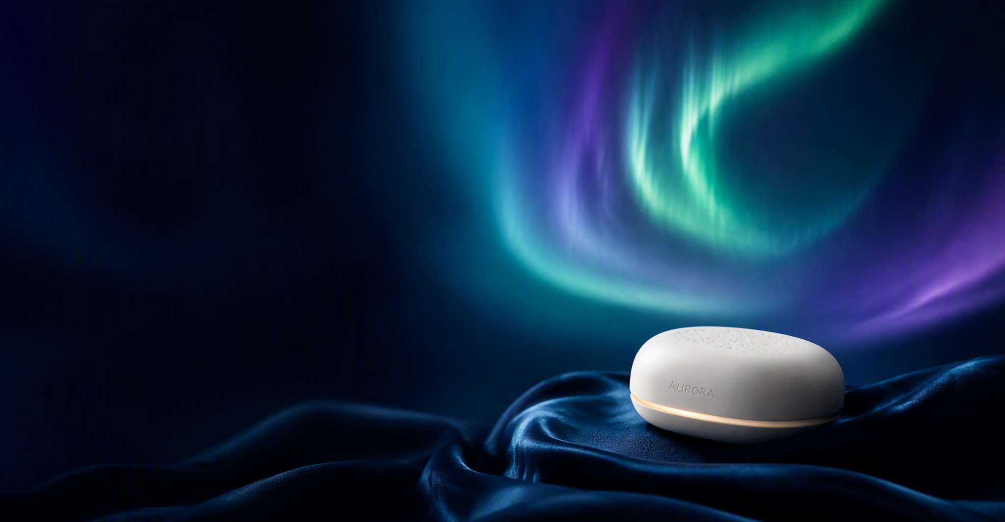
Sleep, beautifully engineered. A full identity and digital home for a fictional Stockholm sleep-tech startup — shown here as an example of how a complete project story is told.
Aurora had a remarkable product — a sleep system that senses, learns and adapts — but no brand to match it. In a market full of clinical gadgets and pastel wellness clichés, they needed an identity that felt as calm and intelligent as the technology itself: premium without coldness, scientific without jargon.
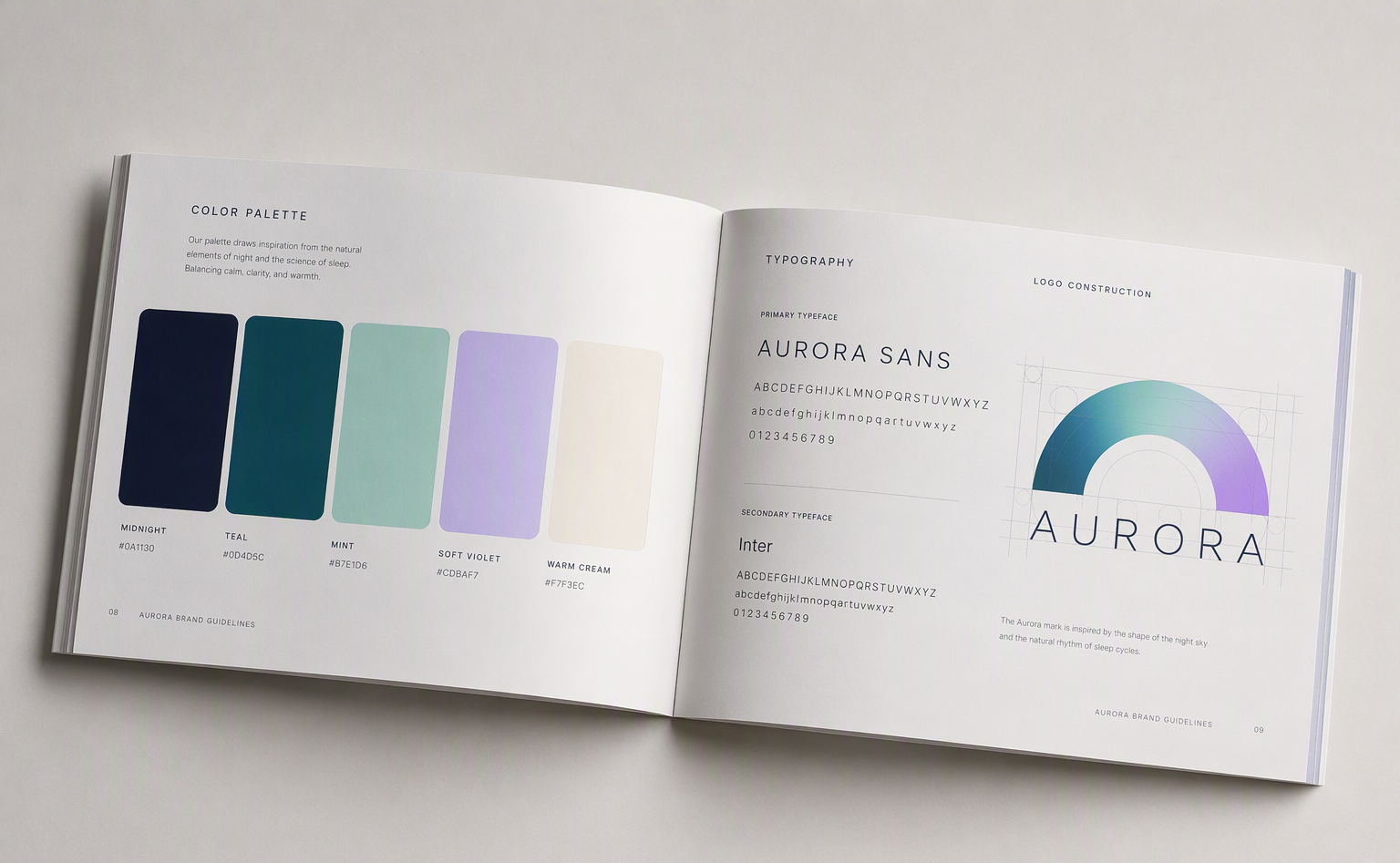
The mark is a single arc of light — the moment the aurora breaks over the horizon, and the curve of a sleep cycle completing itself. One gesture that works at every scale, from a favicon to a shipping box. The palette moves from deep midnight ink through teal and mint to soft violet, always returning to a warm cream that keeps the system human.
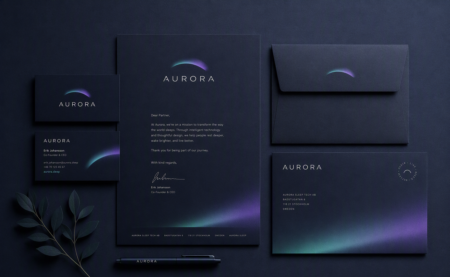
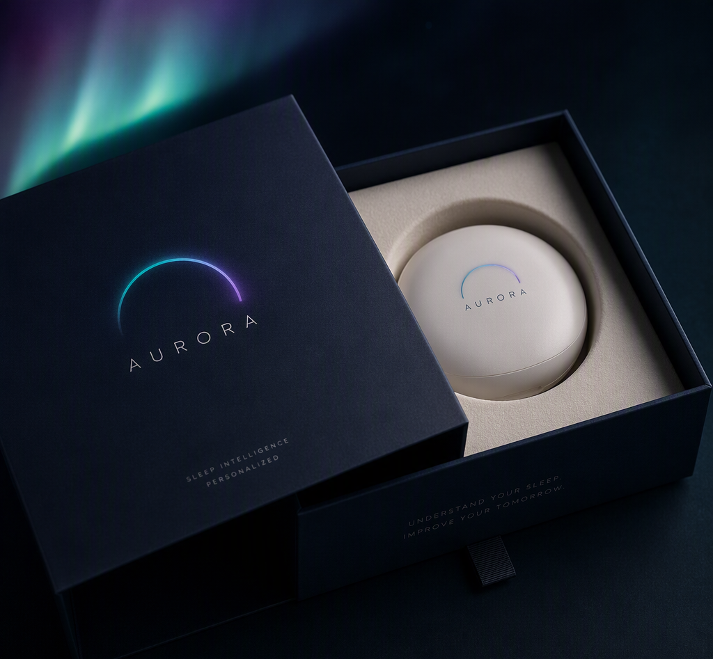
The website opens in near-darkness and lets the aurora do the talking — slow gradients, generous space, one idea per screen. The product story unfolds from science to feeling: what it senses, how it learns, why mornings change. The companion app carries the same language into the daily ritual — a glanceable sleep score, honest trends, nothing that glows at 2 a.m. without reason.
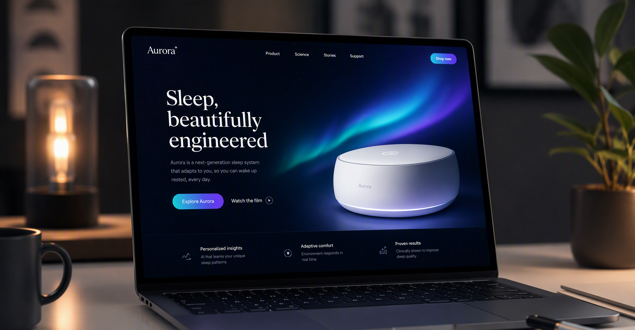
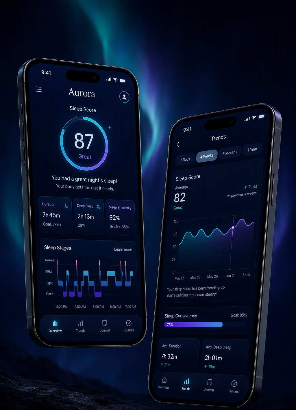
For each project, 4–6 images is the sweet spot: one hero (16:9, 2K), identity in context, web/app on devices, one detail shot. Keep one palette and one lighting mood across the whole set — consistency reads as craft.
Aurora is a concept project. The identity is designed to help a waitlist grow and to give retail partners a brand they want to stock, and it is built to hold up everywhere from a 6-metre booth wall to a 16-pixel favicon. (Concept work, no real client results.)