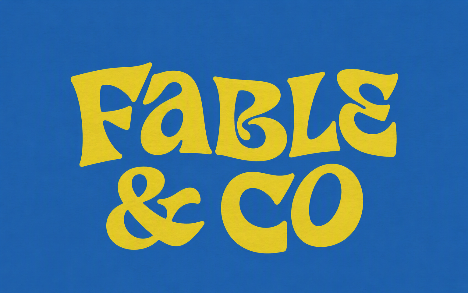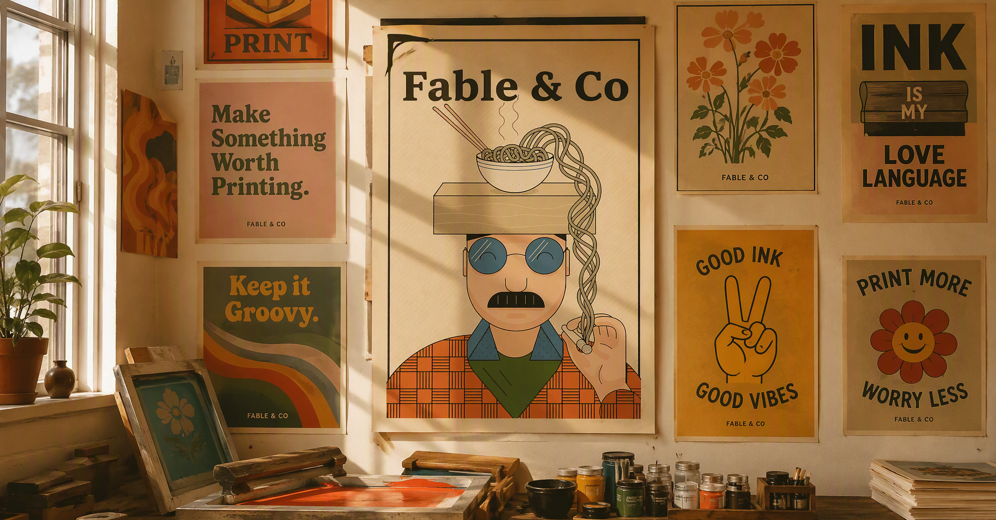
Good ink, good vibes. A groovy retro identity for a print studio that turns illustration into tees, posters and paper goods worth keeping.
Fable & Co made prints people loved at markets — then disappeared online. No logo, no system, nothing that carried the joy of the work between a poster tube and an Instagram grid. They needed an identity as warm and hand-made as the prints themselves: retro without costume, playful without childishness.
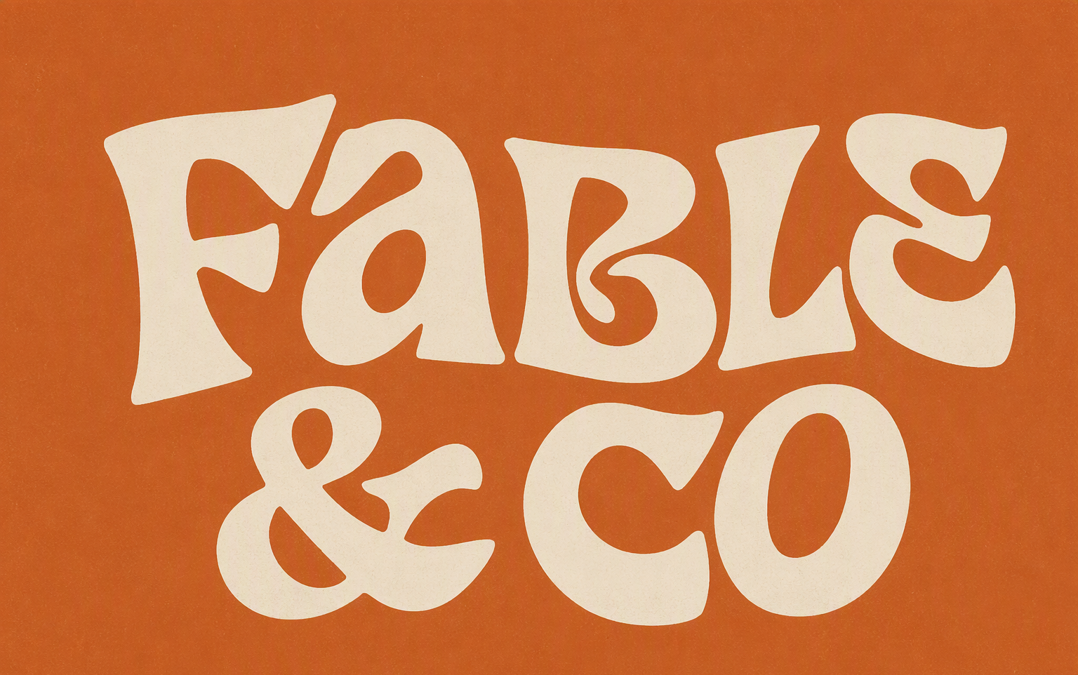
The brand grew out of the designer's own illustration archive — a whole cast of groovy characters, led by the Spaghetti Cowboy and the Hugging Heart. Around them: a custom wordmark with wavy psychedelic letterforms, sunburst marks, and a 70s pantry palette of burnt orange, dusty green, mustard and cream. Everything looks screen-printed, because everything is.
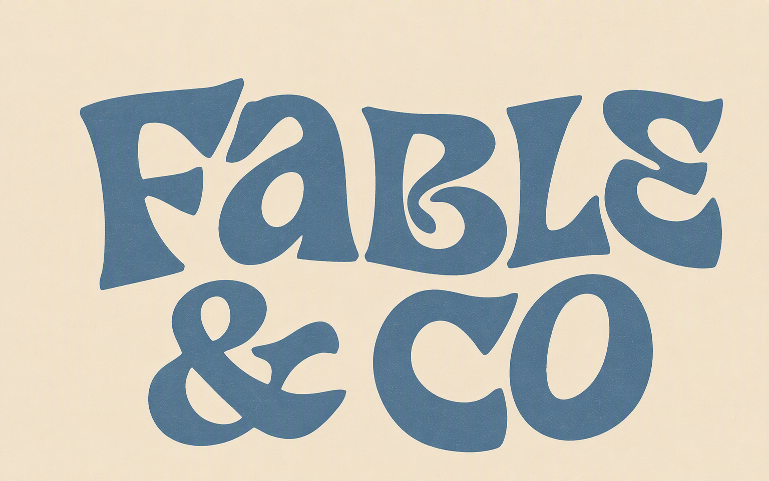
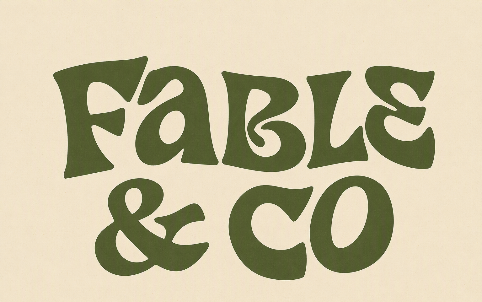
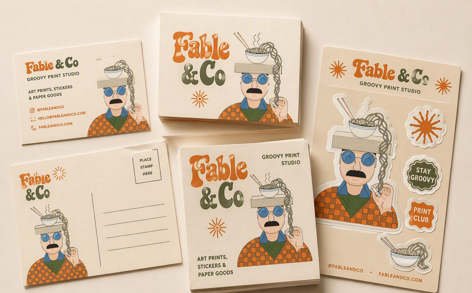
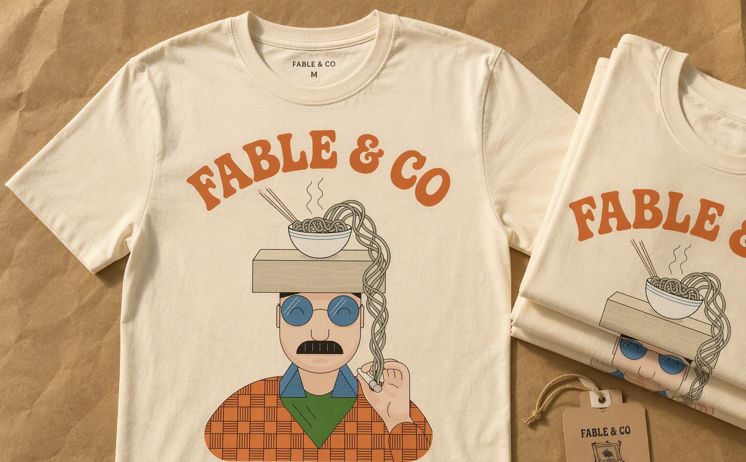
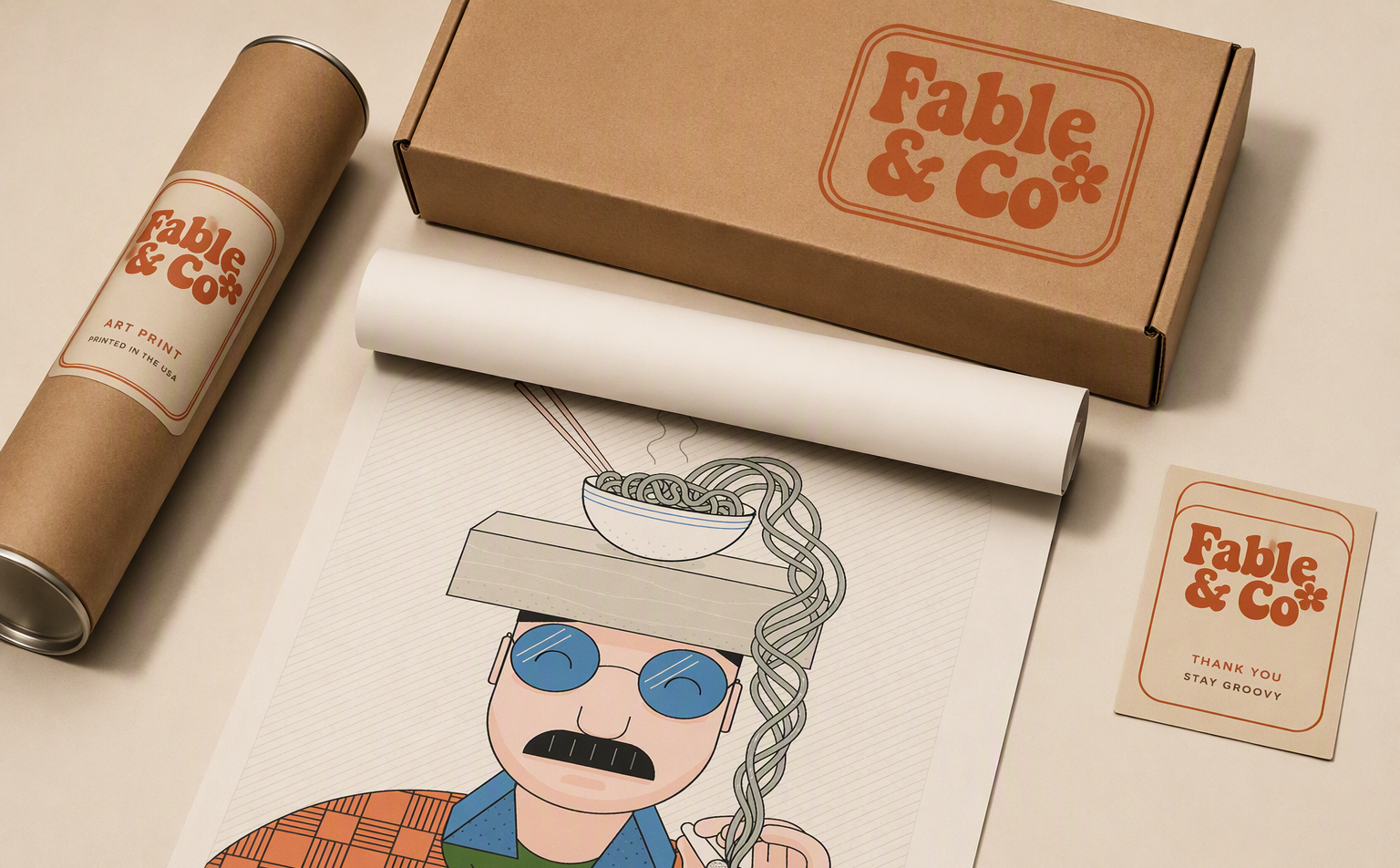
Every artwork in the archive becomes a product — tees, posters, totes, stickers. The rule stays the same across the whole series: real ink on real materials, photographed in real light, so the colour and linework do the talking. A brand for a print studio should never look digital.
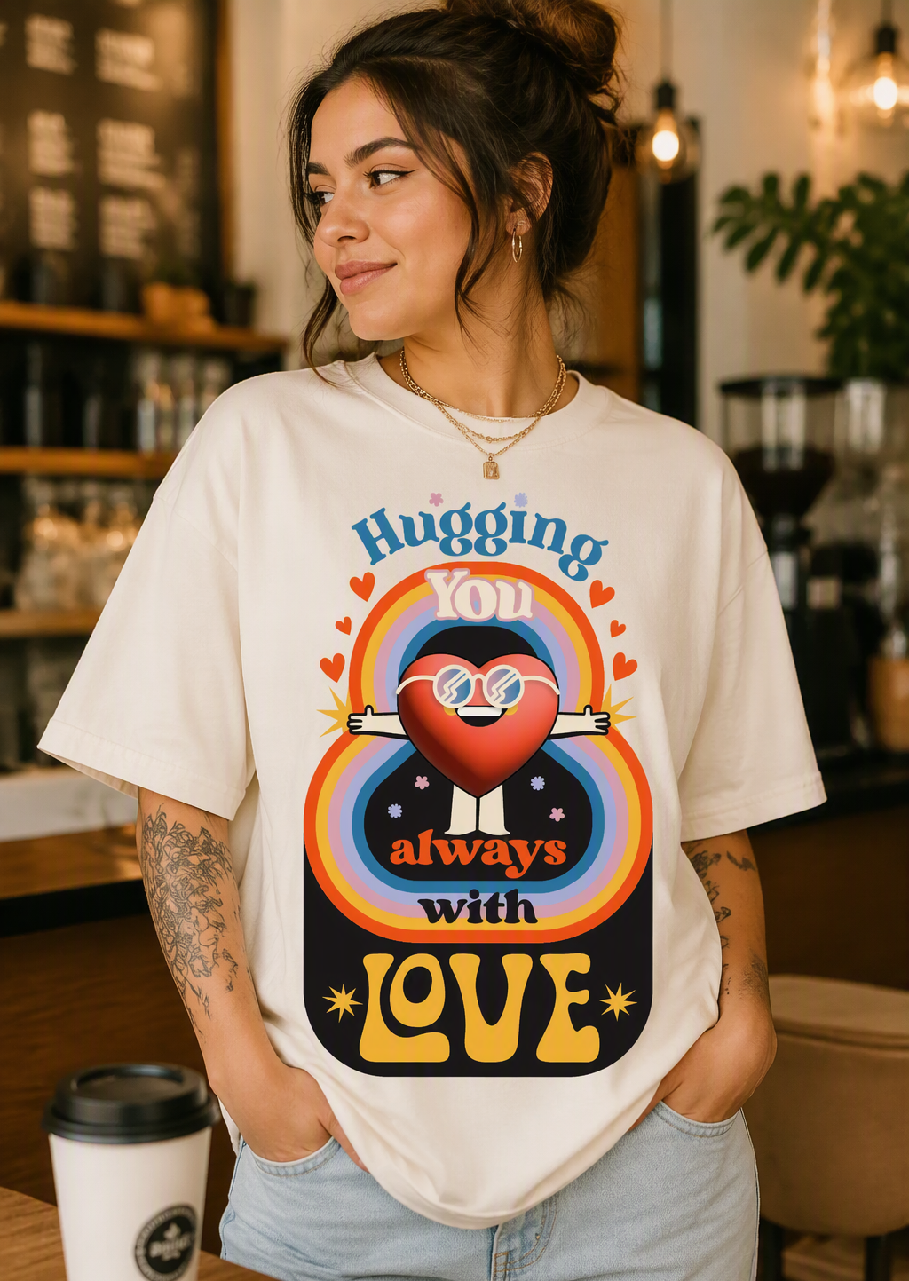
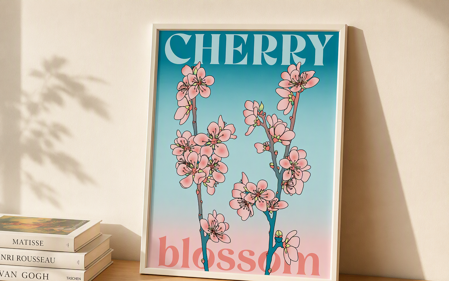
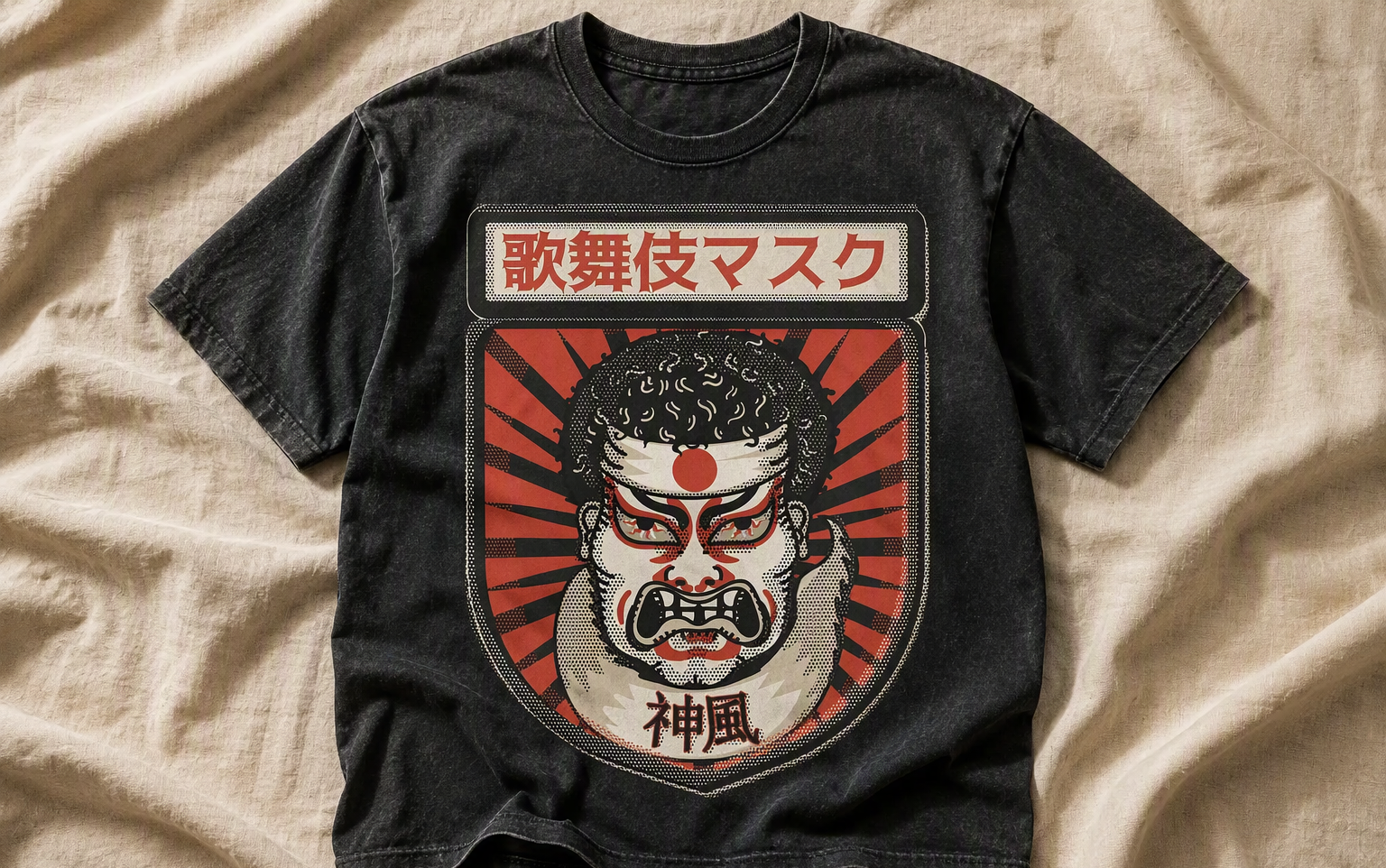
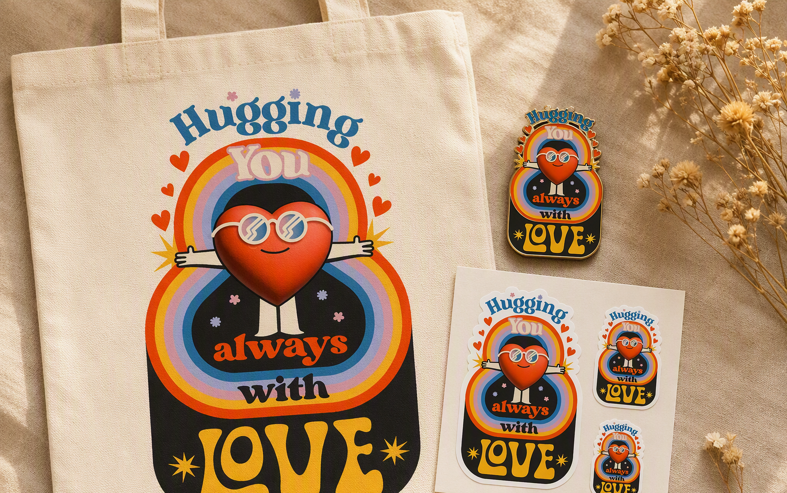
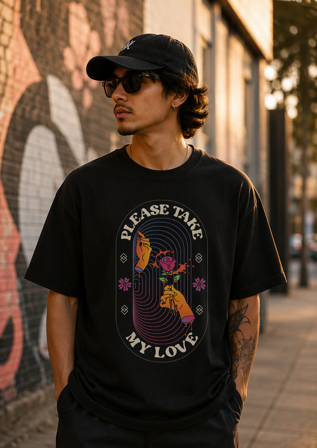
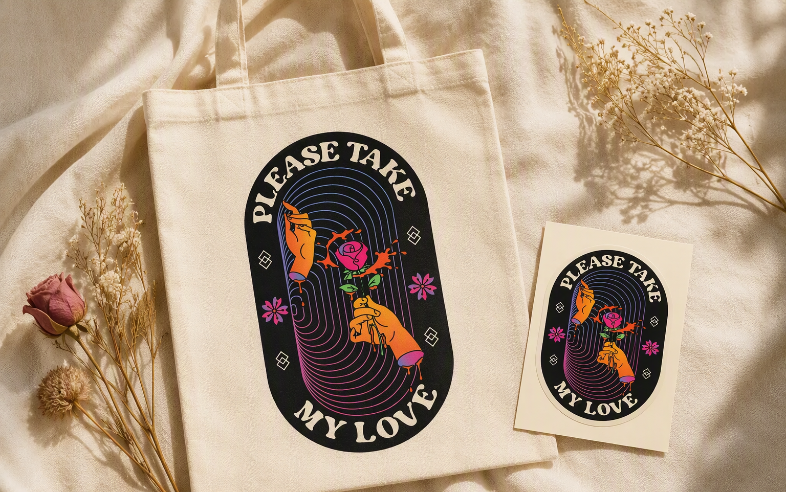
Fable & Co is a concept project. The launch drop of tees, posters and sticker sheets is designed to feel collectable, with the Spaghetti Cowboy as the face people should recognise before the name. (Concept work, no real client results.)